Brand & Design
Without a Designer
You do not need a designer. You need a system — a handful of colors, two fonts, and rules you stick to. Consistency is the cheat code.
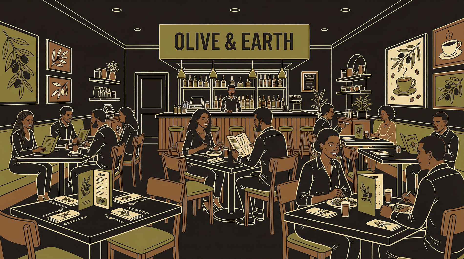
A design system is your restaurant's visual identity. The wall color, the menu style, the uniforms, the napkins, the signage. You would not paint each room a different color and play jazz in one and heavy metal in another. Pick a vibe, document it, apply it everywhere.
A mediocre design applied perfectly and consistently looks more professional than a brilliant design applied inconsistently. The human eye does not judge individual elements — it judges whether things feel like they belong together.
Your website, your app, your pitch deck, your social media — they all need to feel like the same brand. Same colors, same fonts, same tone. When a user visits your website and then opens your app, it should feel like walking between rooms in the same building.
This does not require talent. It requires discipline. Pick your rules, write them down, follow them everywhere. This chapter gives you the exact rules to pick.
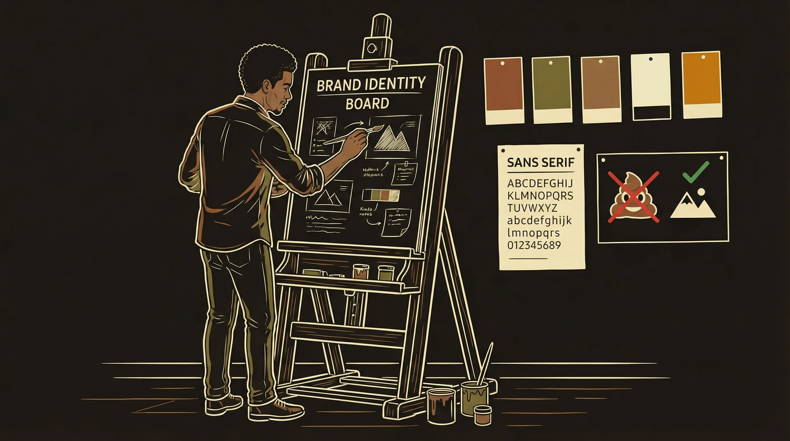
Five or Six Colors, Then Stop
More colors is not more professional. It is more chaos.
You need exactly these color roles: a background color, a primary brand color (buttons, links, emphasis), a secondary color (tags, borders, supporting elements), an accent color (alerts, highlights, calls to action), a dark color (text, deep backgrounds), and optionally a muted/gray for secondary text. That is five or six colors total.
Every additional color is a decision you have to make consistently across every screen. At six colors, the decisions are manageable. At twelve, you are making judgment calls that a trained designer would spend hours on. Keep the palette small and the decisions make themselves.
Where do you find colors? Start with one color you like — your primary. Then use a tool like Coolors, Realtime Colors, or Adobe Color to generate complementary options. Alternatively, find a brand you admire and inspect their CSS — every website's colors are visible if you right-click and inspect the stylesheet.
Once you have your five or six, test them together. Put your background behind your text — is it readable? Put your primary on a button — does it look clickable? If any combination looks wrong, swap that one color. Do not add a seventh to fix it.
A named placeholder for a value you define once and use everywhere. Instead of typing a hex code in fifty places, you define it once and reference it by name. Change the definition and all fifty places update automatically.
/* Define once at the top of your stylesheet */
:root {
  --primary:    #your-brand-color;
  --secondary:  #your-second-color;
  --accent:     #your-highlight-color;
  --bg:         #your-background;
  --text:       #your-text-color;
  --dark:       #your-dark-color;
}

/* Use everywhere */
.button  { background: var(--primary); }
.heading { color: var(--text); }
.alert   { border-left: 3px solid var(--accent); }

/* Change your mind? One edit updates everything. */
This matters because you will change your mind. Everyone does. Without CSS variables, you find and replace a color in hundreds of places. With them, you change one line. When you give AI instructions to build something, include your variables — the AI uses them correctly, and when you change a color later, you change it once.
One or Two Fonts, No More
Every extra font is a loading penalty and a consistency risk.
Pick one font for your entire product. If you want variety, pick a second for headings only. Two fonts maximum. Every extra font increases page load time, creates visual inconsistency, and adds decisions you do not need.
The safe approach: one modern sans-serif for everything. Outfit, Inter, DM Sans, Plus Jakarta Sans — all free on Google Fonts, all readable at every size. If you want personality in headings, pair a display or serif font (Playfair Display, EB Garamond, Space Grotesk) with your body font.
The trap to avoid: using a different font for your website, your app, and your marketing materials. This happens when you build each piece at a different time. Six months later, your brand has four fonts and no identity.
A documented set of rules: your colors (exact hex codes), your fonts (with weights), your spacing scale (multiples of 8px), and your components (how buttons, cards, and inputs look). Write it in one document. This is your brand bible.
The 8px Spacing Scale
One rule that makes everything look intentional.
A fixed set of spacing values used for all padding, margins, and gaps. The industry standard is multiples of 8: 4px, 8px, 16px, 24px, 32px, 48px, 64px, 96px. Every piece of whitespace comes from this list. No random numbers. This single rule makes amateur layouts look professional because humans perceive mathematical consistency as intentional design.
Padding inside a card? 24px. Gap between cards? 16px. Section padding? 48px or 64px. You never have to guess. The scale decides for you.
The AI benefits from this too. When you tell it "use 24px padding inside cards and 16px gaps between them," the output is consistent. When you say "add some padding," the AI picks a random number every time and nothing lines up.
:root {
  --space-xs:  4px;
  --space-sm:  8px;
  --space-md:  16px;
  --space-lg:  24px;
  --space-xl:  32px;
  --space-2xl: 48px;
  --space-3xl: 64px;
  --space-4xl: 96px;
}

/* Use the scale everywhere */
.card { padding: var(--space-lg); }
.card-grid { gap: var(--space-md); }
.section { padding: var(--space-2xl) 0; }
Pick Dark or Light, Then Commit
Supporting both is a second product. Ship one first.
Dark mode and light mode are not a toggle — they are two entirely different design systems. Every color, every border, every shadow needs to be re-evaluated. A shadow that looks elegant on white is invisible on dark. A border that is subtle on dark is jarring on light.
Pick one. Ship it. If your product is content-heavy (reading, documents), light mode is usually safer. If your product is media-heavy or a tool for extended sessions (dashboards, dev tools), dark mode reduces eye strain and often looks more polished.
If you eventually add the other theme, do it as a dedicated project — not a quick CSS swap. Every screen needs to be re-tested.
AI-Generated Logos Actually Work Now
Generate 20-30 variations, select 2-3, refine.
A year ago, AI image generators produced logos that looked like clip art. That has changed. Tools like Midjourney, DALL-E, and Ideogram now produce clean, professional logos — often better than a $50 Fiverr order. The workflow: describe your brand's tone, generate 20-30 variations, identify the 2-3 strongest candidates, then refine with follow-up prompts or minor edits in Figma or Canva.
The one area where AI still struggles: pixel-perfect icons at very small sizes (16x16, 24x24). At that scale, every pixel matters and AI generators cannot guarantee precision. For small icons, use a curated icon library.
Icon Libraries: Pick One and Stay
Mixing icon sets is the fastest way to look amateur.
| Library | Icons | Style | Best For |
|---|---|---|---|
| Heroicons | 300+ | Outline + solid | Tailwind/React Native products. Made by the Tailwind team. |
| Lucide | 1,400+ | Consistent stroke | Projects needing a massive library. Fork of Feather, very active. |
| Phosphor | 9,000+ | 6 weights per icon | Design-heavy products wanting weight flexibility. |
| Feather | 280+ | Outline only | Minimal products. The original clean set. No longer maintained. |
The cardinal rule: never mix libraries. Mixing means inconsistent stroke widths, different optical weights, and subtle visual dissonance users feel even if they cannot name it.
A reusable UI building block — a button, a card, an input field. Design it once with your colors, fonts, and spacing, then reuse everywhere. Every button should look the same. Every card should have the same padding, border radius, and shadow. Components are how design systems stay consistent at scale.
The Mockup Workflow
How to get production-quality design from AI every time.
Describe
Purpose, content, constraints
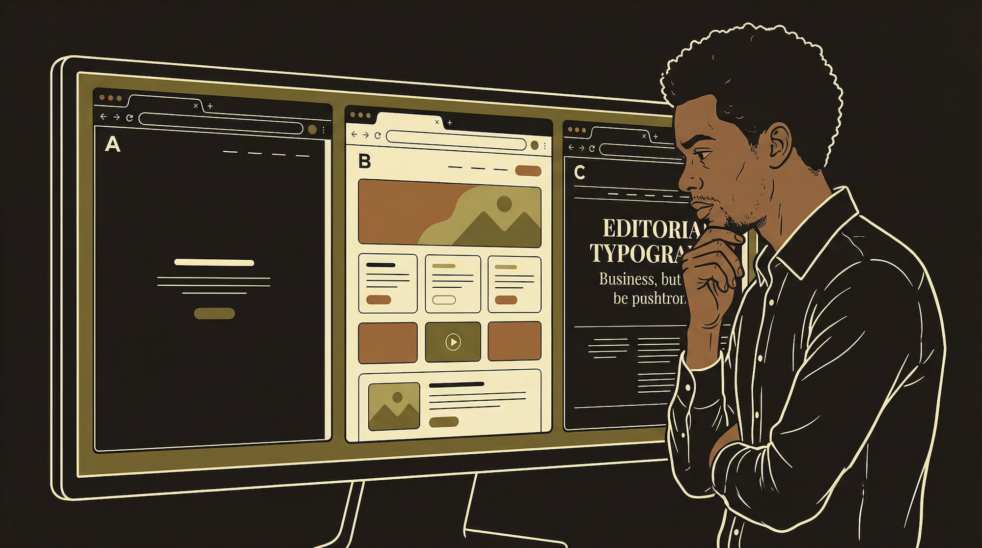
3 Options
Genuinely different layouts
Pick Direction
Combine best elements
Build Final
Production quality output
When you need something visual — a new page, a screen, a marketing graphic — ask for three visually distinct approaches. Not three slight variations. Genuinely different layouts, hierarchies, emphasis. This forces creative range.
Your design system is the guardrail. When your instructions include specific colors, fonts, and spacing rules, the AI cannot default to generic purple gradients. It produces something that feels intentionally designed rather than automatically generated.
The key phrase in your prompt: "Use my design system" followed by your CSS variables, font names, and spacing scale. The AI with your design system produces better results than the AI with a vague "make it look professional."
Without a design system, every AI-generated screen looks the same: purple-to-blue gradient, Inter font, 12px rounded corners, white cards on gray background. This is "AI slop" — technically functional, visually identical to everything else. Your design system is the antidote. It forces the AI to produce something that looks like your product, not a generic template.
Write all of this in a single document: hex codes, font names and weights, spacing scale, component rules, icon library choice. This is your brand bible. Every time you — or your AI — builds something new, reference it. One document, consistently applied, is worth more than a thousand dollars of design consulting.
What Goes in Your Brand Document
The checklist. One page. Every decision you need.
Colors
5-6 hex codes with role labels (primary, secondary, accent, background, dark, muted). Include rgba variants for transparency if needed.
Fonts
1-2 font names, their weights (400, 600, 700), and where each is used. Include the Google Fonts import URL.
Spacing
Your scale (4, 8, 16, 24, 32, 48, 64, 96). Border radius values. Note which spacing is for cards, sections, and gaps.
Components
How buttons, cards, inputs, alerts, and warnings look. Colors, padding, border radius for each. Include your icon library choice.
What to Watch For
Drift. You start with a clean system. Then a quick landing page uses a slightly different shade "just this once." Then 18px padding instead of 16px. Six months later, thirty colors, no system. Audit quarterly. Delete anything that does not match your brand document.
Accessibility. Your color combinations need sufficient contrast for users with visual impairments. Check with a contrast checker (WebAIM has a free one). Minimum ratio for normal text is 4.5:1. This is not just good practice — app store reviewers and some legal frameworks require it.